Designing a Highly Reusable HTML Component

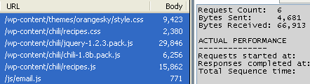
The UF College of Education uses a header/footer template designed to be applied to any page, and we use this across several applications such as WordPressMoodleElgg, and Drupal. Changes can be propagated quickly to all sites, and adding the template to new PHP apps is trivial.

If you need to create an HTML component that can be reused across a wide set of sites/apps, these guidelines might help.

Avoid HTML5 elements if you can

HTML5 elements like header must be accompanied by JS to fix compatibility in old browsers. Sticking to HTML4 also helps with validation under HTML4/XHTML doctypes. Of course, if you’ll only be deploying to HTML5 sites that already have the IE shim, go ahead and use the best markup elements for the job.

Guard the host markup against the component CSS

Any component CSS selectors that match host markup elements can cause massive problems in the host application, and if this component is applied across an entire site, it’s very difficult to predict the impact. The key then is following a few simple rules for the component CSS:

  1. Each class/id name must be sufficiently unique such that there’s practically no chance of name collision. Unfortunately even selectors like .hidden and .clearfix could be implemented in different ways in the host app and this could cause problems. Using a constant prefix in every name might help.
  2. Each selector must include at least one of the component classes/ids.
  3. Avoid using a CSS reset/normalizer. If you must, make sure each selector follows the above rules so the effect of this is limited in scope to the component.
  4. Selectors must not match non-component elements. E.g. the selector #component-root + div should not be used because it would select a DIV element after the component.
  5. Take care to avoid obscuring elements in the host page. E.g. negative margins could pull the component over a host element.

Guard the component markup against the host CSS

Similarly, host CSS could break the desired styling of the component markup.

  • Test the component in a wide variety of pages and applications. Especially test pages that use common CSS resets and normalizers, and that have a lot of element-only selectors in the CSS.
  • When interactions occur, make the affected element’s selector more specific until the component CSS “wins”. As always, test across the browsers you need to support; IE7 still has some specificity bugs for the selectors it understands, if you need to care about that.

Javascript Tips

Expose as little to the global namespace as possible

E.g., define all necessary functions and variables inside an anonymous function that is executed:

!function () {
  // your code here ...

  // explicitly expose an API
  this.myComponentAPI = api;
}();

Document your script’s dependencies and let the implementor supply those

Automatically including JS libraries may break the host app. Consider the case of jQuery: Many plugins extend the jQuery object, so redefining it removes those added functions (actually stores them away, but it will break the host app nonetheless). Don’t assume the user did this right. Wrap your functionality in a condition that first tests for the presence of the the library/specific features you need, and make it easy for the implementer to realize the problem if they have a console open.

Here’s an example of how to test for jQuery’s on function:

if (this.jQuery && jQuery.fn.on) {
  // code
} else if (this.console && console.log) {
  console.log('Requires jQuery.on, added in version 1.7');
}

Assume the component could be embedded after the page loads, and multiple times

Carefully consider the initialization process your component requires. In some cases it’s reasonable to leave the initialization to be triggered by the implementer. If you do automatically use DOMReady functions like jQuery’s ready(), consider allowing the implementer to cancel this and initialize later.

IE6/7 CSS Specificity Bug

After our team launched the new College of Education site, I discovered that IE8’s handy “Browser Mode: IE7” mode of IE8 is useless for real IE7 testing (but IETester actually works!). Undoubtedly this “IE7 mode” has many quirks in its emulation we’ll never know about, but after a few hours of hair-pulling I finally pinned down a real IE6/7 bug that the emulator doesn’t have.

IE versions before 8 apparently vary in their calculation of CSS specificity depending on the order of elements in the selectors. What this means for poor suckers who worry about IE6/7 is that rules that appear later and (should) match specificity won’t always override values. E.g.

<div id="foo"><div id="bar">I should be green.</div></div>
/* both rules have the same specificity */
#foo div  { background:red   /* IE6/7 apply this value */ }
div  #bar { background:green /* correct value to apply */ }

This bug will hit you when you’re pursuing a good goal: trying to keep selectors short. So in these situations make sure to test in IETester at the very least and leave a comment to let future CSS editors know why a selector is longer than needs to be.

We need a frontend design tool for live web pages

It’s quite frequently that an HTML/CSS designer might want to make changes to a live web page. Maybe she doesn’t have write access, or maybe the fixes needed aren’t worth the start-up cost of copying the page locally and working on it there, or multiple designers want to work up ideas on a given page simultaneously. The “Inspect Element” capabilities of most modern browsers will let you make HTML/CSS changes to a live page, but navigating or refreshing causes those changes to be lost, and they’re hard to keep track of.

Here’s a feature wishlist:

  1. keep track of “Inspect Element” user changes with the ability to save them locally
  2. keep changes in discrete “changesets” that can be re-applied, or saved as a unified patch of the original files, or at least as the modified original files
  3. allow swapping page CSS files with user-controlled CSS files (e.g. file:/// or htttp://localhost/)
  4. allow swapped CSS files to be periodically “refreshed” so the user wouldn’t have to switch between CSS editor and browser.

Firefox’s Stylish extension looks to come close to (3), allowing you to add user styles to a page/site, like Greasemonkey does for Javascript. It doesn’t look like the editing experience is great, though.

You can manually do (3) and use the CSS Reload Every bookmarklet, but it reloads all CSS, which is kinda of jarring.

A bookmarklet could implement (3) and (4) and persist its settings in a cookie.

Other ideas?

Update: Here’s a bookmarklet that let’s you swap CSS files and stores its settings in a cookie for the current page. Next step is for it to allow adding files and controlling the cookie path.

You must enable Javascript! (right-click, add to favorites or bookmarks)

(CSSswap source).

IE9 May Raise the Bar

Wow.

IE9 passing a bunch of tests

IE9 is coming, and it looks like it’ll get Microsoft back in the game. Full Developer Guide.

The Good: New standards supported, hardware-accelerated canvas, SVG, Javascript speed on par with the other browsers, preview installs side-by-side with IE.

The Bad: Not available on XP and no guarantee it will be. XP users will be stuck with, you know, all the other browsers that run their demos fine.

Get higher quality images within printed web pages

Due to web images being optimized for on-screen display (let’s say 96 DPI), images on printed pages are usually blurry, but they don’t have to be:

  1. Start with a high-resolution image. E.g. 2000 x 1000.
  2. Save a version with dimensions that fit well in your printed layout when placed in an IMG element. E.g. 300 x 150.
  3. In your print CSS, fix the size of the IMG element in pixels to match the dimensions in (2).
  4. Using the original image, recreate the image file in (2) with significantly larger dimensions (identical width/height ratio). E.g. 600 x 300.

The Good News: The printed page will have an identical layout as in (2), but with a higher quality image. This is because–according to my testing–even browsers that use blocky “nearest neighbor” image scaling for screen will scale nicely for print.

The Bad News: Continue reading  

Minifying Javascript and CSS on mrclay.org

Update: Please read the new version of this article. It covers Minify 2.1, which is much easier to use.

Minify v2 is coming along, but it’s time to start getting some real-world testing, so last night I started serving this site’s Javascript and CSS (at least the 6 files in my WordPress templates) via a recent Minify snapshot.

As you can see below, I was serving 67K over 6 requests and was using some packed Javascript, which has a client-side decompression overhead.

fiddler1.png

Using Minify, this is down to 2 requests, 28K (58% reduction), and I’m no longer using any packed Javascript:

fiddler2.png

Getting it working

  1. Exported Minify from svn (only the /lib tree is really needed).
  2. Placed the contents of /lib in my PHP include path.
  3. Determined where I wanted to store cache files (server-side caching is a must.)
  4. Gathered a list of the JS/CSS files I wanted to serve.
  5. Created “min.php” in the doc root:
    // load Minify
    require_once 'Minify.php';
    
    // setup caching
    Minify::useServerCache(realpath("{$_SERVER['DOCUMENT_ROOT']}/../tmp"));
    
    // controller options
    $options = array(
    	'groups' => array(
    		'js' => array(
    			'//wp-content/chili/jquery-1.2.3.min.js'
    			,'//wp-content/chili/chili-1.8b.js'
    			,'//wp-content/chili/recipes.js'
    			,'//js/email.js'
    		)
    		,'css' => array(
    			'//wp-content/chili/recipes.css'
    			,'//wp-content/themes/orangesky/style.css'
    		)
    	)
    );
    
    // serve it!
    Minify::serve('Groups', $options);

    (note: The double solidi at the beginning of the filenames are shortcuts for $_SERVER['DOCUMENT_ROOT'].)

  6. In HTML, replaced the 4 script elements with one:
    <script type="text/javascript" src="/min/js"></script>

    (note: Why not “min.php/js”? Since I use MultiViews, I can request min.php by just “min”.)

  7. and replaced the 2 stylesheet links with one:
    <link rel="stylesheet" href="/min/css" type="text/css" media="screen" />

At this point Minify was doing its job, but there was a big problem: My theme’s CSS uses relative URIs to reference images. Thankfully Minify’s CSS minifier can rewrite these, but I needed to specify that option just for style.css.

I did that by giving a Minify_Source object in place of the filename:

// load Minify_Source
require_once 'Minify/Source.php';

// new controller options
$options = array(
	'groups' => array(
		'js' => array(
			'//wp-content/chili/jquery-1.2.3.min.js'
			,'//wp-content/chili/chili-1.8b.js'
			,'//wp-content/chili/recipes.js'
			,'//js/email.js'
		)
		,'css' => array(
			'//wp-content/chili/recipes.css'

			// style.css has some relative URIs we'll need to fix since
			// it will be served from a different URL
			,new Minify_Source(array(
				'filepath' => '//wp-content/themes/orangesky/style.css'
				,'minifyOptions' => array(
					'prependRelativePath' => '../wp-content/themes/orangesky/'
				)
			))
		)
	)
);

Now, during the minification of style.css, Minify prepends all relative URIs with ../wp-content/themes/orangesky/, which fixes all the image links.

What’s next

This is fine for now, but there’s one more step we can do: send far off Expires headers with our JS/CSS. This is tricky because whenever a change is made to a source file, the URL used to call it must change in order to force the browser to download the new version. As of this morning, Minify has an elegant way to handle this, but I’ll tackle this in a later post.

Update: Please read the new version of this article. It covers Minify 2.1, which is much easier to use.

Why CSS layout is hard

The complaints are many and oft-repeated: “CSS has no grid system”, “the cascade is dumb”, “it’s broken”, etc. So why is CSS layout so hard? The obvious answer is that doing anything really well isn’t always easy. Most anyone can make a page in a modern WYSIWG editor (DW8/GoLiveCS2) in five minutes and have an accessible web page that nearly browser can read, and it can even look good–in that area we’ve come a long way–but it won’t necessarily look professional. There’s always a point in any field where your goals outmatch your abilities and I don’t see why CSS should be expected to be any different.

As for specifics, plain old CSS2 (1998!) can accomplish just about any layout you can dream up, but standing in your way more than anything else is the IE Factor. Even the upcoming version 7, which we’ll be supporting for a long time to come, will not support the table-* values for display that make multi-column layout easy as cake. Is it the CSS working group’s fault that a browser fails to implement standards for almost a decade? If existing standards aren’t supported, why should we believe alternatives would be/would’ve been? The sad part in the case of display is that IE also cannot change the display properties of table elements (the color chart is a table as it should be).

I’ve seen the point made that the cascade is great for text-styling, but terrible for layout. This person probably didn’t notice that the values of layout properties like display, position and float don’t actually cascade (aren’t inherited from the parent element). Oops.

Now, to give credit to the critics, there are a couple areas where I see CSS2 partucularly fails to deliver: 1) floated elements must precede elements that “wrap around” them in the markup. This is not usually a big issue since markup is easy to control, but at least one CSS3 draft addresses this. 2) the table-* display values mentioned before cannot duplicate table layouts that use rowspan/colspan. Again, the WG has put work into it, but don’t expect to see this anytime soon. Then again, non-IE browsers continuously forge ahead, supporting various bits of CSS3 like selectors, multiple backgrounds, rounded corners, opacity, speech, multi-columnal layout…